swanlab.echarts
SwanLab 兼容 pyecharts 的 API,可以方便地记录 pyecharts 的图表到 SwanLab,以呈现丰富的数据组织和图表展现形式。
在线Demo点击下面的标签:

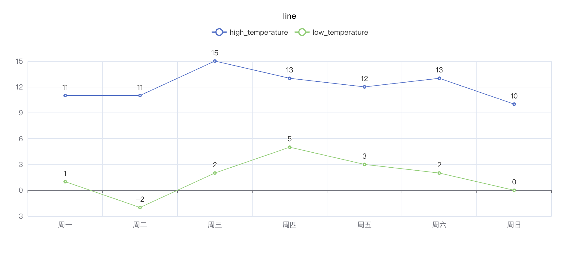
折线图 line
python
import swanlab

swanlab.init(project="echarts-test")

# 定义数据
week_name_list = ["周一", "周二", "周三", "周四", "周五", "周六", "周日"]
high_temperature = [11, 11, 15, 13, 12, 13, 10]
low_temperature = [1, -2, 2, 5, 3, 2, 0]

# 创建echarts line对象
line = swanlab.echarts.Line()

# 设置line的轴
line.add_xaxis(week_name_list)
# 设置line的数据
line.add_yaxis("high_temperature", high_temperature)
line.add_yaxis("low_temperature", low_temperature)

# 记录到swanlab
swanlab.log({"line": line})
python
"""
demo:
https://swanlab.cn/@ZeyiLin/swanlab-echarts-demo/runs/trptzejp9037cimxd786e/chart#eDczbzM0-blJ6R3dXSFU=
"""
import swanlab
import pyecharts.options as opts
swanlab.init(project="echarts-test")
# 定义数据
week_name_list = ["周一", "周二", "周三", "周四", "周五", "周六", "周日"]
high_temperature = [11, 11, 15, 13, 12, 13, 10]
low_temperature = [1, -2, 2, 5, 3, 2, 0]
# 创建echarts line对象
line = swanlab.echarts.Line()
# 设置line的轴
line.add_xaxis(week_name_list)
# 设置line的数据
line.add_yaxis("high_temperature", high_temperature)
line.add_yaxis("low_temperature", low_temperature)
# 设置不透明度为0.5
line.set_series_opts(areastyle_opts=opts.AreaStyleOpts(opacity=0.5))
# 记录到swanlab
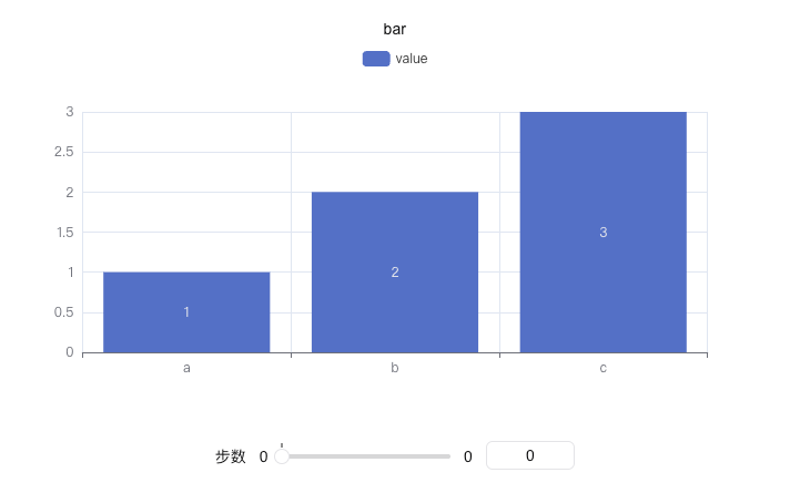
swanlab.log({"line_opacity": line})柱状图 bar
python
import swanlab

swanlab.init(project="echarts-test")

# 定义数据
x = ["a", "b", "c"]
y = [1, 2, 3]

# 创建echarts bar对象
bar = swanlab.echarts.Bar()

# 设置x轴数据
bar.add_xaxis(x)
# 设置y轴数据
bar.add_yaxis("value", y)

# 记录到swanlab
swanlab.log({"bar": bar})
python
"""
demo:
https://swanlab.cn/@ZeyiLin/swanlab-echarts-demo/runs/rtqyhofvc5080tpmdfxkz/chart#bGw5M2My-ZnRhOGRnWVE=
"""
import swanlab
swanlab.init(project="echarts-test")
# 定义数据
x = ["a", "b", "c"]
y = [1, 2, 3]
# 创建echarts bar对象
bar = swanlab.echarts.Bar()
# 设置x轴数据
bar.add_xaxis(x)
# 设置y轴数据
bar.add_yaxis("value", y)
# 翻转
bar.reversal_axis()
# 记录到swanlab
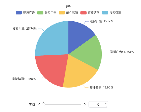
swanlab.log({"bar_horizontal": bar})饼状图 pie
python
import swanlab
swanlab.init(project="echarts-test")
# 定义数据
x_data = ["直接访问", "邮件营销", "联盟广告", "视频广告", "搜索引擎"]
y_data = [335, 310, 274, 235, 400]
# 组合数据
data_pair = [list(z) for z in zip(x_data, y_data)]
data_pair.sort(key=lambda x: x[1])
# 创建echarts pie对象
pie = swanlab.echarts.Pie()
# 设置x轴数据并配置标签显示
pie.add(
"访问来源",
data_pair,
# 配置标签显示
label_opts={
"formatter": "{b}: {d}%", # 显示百分比
"position": "outside" # 标签位置
}
)
# 记录到swanlab
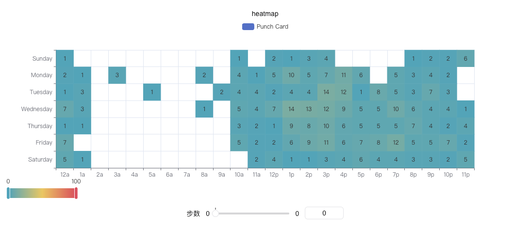
swanlab.log({"pie": pie})热力图 heatmap
python
import swanlab

swanlab.init(project="echarts-test")

# 定义数据
hours = ["12a", "1a", "2a", "3a", "4a", "5a", "6a", "7a", "8a", "9a", "10a", "11a", "12p", "1p", "2p", "3p", "4p", "5p", "6p", "7p", "8p", "9p", "10p", "11p"]

days = ["Saturday", "Friday", "Thursday", "Wednesday", "Tuesday", "Monday", "Sunday"]

data = [
    [0, 0, 5], [0, 1, 1], [0, 2, 0], [0, 3, 0], [0, 4, 0], [0, 5, 0], [0, 6, 0], [0, 7, 0], [0, 8, 0], [0, 9, 0], [0, 10, 0], [0, 11, 2], [0, 12, 4], [0, 13, 1], [0, 14, 1], [0, 15, 3], [0, 16, 4], [0, 17, 6], [0, 18, 4], [0, 19, 4], [0, 20, 3], [0, 21, 3], [0, 22, 2], [0, 23, 5],
    [1, 0, 7],[1, 1, 0],[1, 2, 0],[1, 3, 0],[1, 4, 0],[1, 5, 0],[1, 6, 0],[1, 7, 0],[1, 8, 0],[1, 9, 0],[1, 10, 5],[1, 11, 2],[1, 12, 2],[1, 13, 6],[1, 14, 9],[1, 15, 11],[1, 16, 6],[1, 17, 7],[1, 18, 8],[1, 19, 12],[1, 20, 5],[1, 21, 5],[1, 22, 7],[1, 23, 2],
    [2, 0, 1],[2, 1, 1],[2, 2, 0],[2, 3, 0],[2, 4, 0],[2, 5, 0],[2, 6, 0],[2, 7, 0],[2, 8, 0],[2, 9, 0],[2, 10, 3],[2, 11, 2],[2, 12, 1],[2, 13, 9],[2, 14, 8],[2, 15, 10],[2, 16, 6],[2, 17, 5],[2, 18, 5],[2, 19, 5],[2, 20, 7],[2, 21, 4],[2, 22, 2],[2, 23, 4],
    [3, 0, 7],[3, 1, 3],[3, 2, 0],[3, 3, 0],[3, 4, 0],[3, 5, 0],[3, 6, 0],[3, 7, 0],[3, 8, 1],[3, 9, 0],[3, 10, 5],[3, 11, 4],[3, 12, 7],[3, 13, 14],[3, 14, 13],[3, 15, 12],[3, 16, 9],[3, 17, 5],[3, 18, 5],[3, 19, 10],[3, 20, 6],[3, 21, 4],[3, 22, 4],[3, 23, 1],
    [4, 0, 1],[4, 1, 3],[4, 2, 0],[4, 3, 0],[4, 4, 0],[4, 5, 1],[4, 6, 0],[4, 7, 0],[4, 8, 0],[4, 9, 2],[4, 10, 4],[4, 11, 4],[4, 12, 2],[4, 13, 4],[4, 14, 4],[4, 15, 14],[4, 16, 12],[4, 17, 1],[4, 18, 8],[4, 19, 5],[4, 20, 3],[4, 21, 7],[4, 22, 3],[4, 23, 0],
    [5, 0, 2],[5, 1, 1],[5, 2, 0],[5, 3, 3],[5, 4, 0],[5, 5, 0],[5, 6, 0],[5, 7, 0],[5, 8, 2],[5, 9, 0],[5, 10, 4],[5, 11, 1],[5, 12, 5],[5, 13, 10],[5, 14, 5],[5, 15, 7],[5, 16, 11],[5, 17, 6],[5, 18, 0],[5, 19, 5],[5, 20, 3],[5, 21, 4],[5, 22, 2],[5, 23, 0],
    [6, 0, 1],[6, 1, 0],[6, 2, 0],[6, 3, 0],[6, 4, 0],[6, 5, 0],[6, 6, 0],[6, 7, 0],[6, 8, 0],[6, 9, 0],[6, 10, 1],[6, 11, 0],[6, 12, 2],[6, 13, 1],[6, 14, 3],[6, 15, 4],[6, 16, 0],[6, 17, 0],[6, 18, 0],[6, 19, 0],[6, 20, 1],[6, 21, 2],[6, 22, 2],[6, 23, 6],
]
data = [[d[1], d[0], d[2] or "-"] for d in data]

# 创建echarts heatmap对象
heatmap = swanlab.echarts.HeatMap()

# 设置x轴数据并配置标签显示
heatmap.add_xaxis(hours)
heatmap.add_yaxis(
  "Punch Card",
  days,
  data,
)

# 记录到swanlab
swanlab.log({"heatmap": heatmap})
python
"""
demo:
https://swanlab.cn/@ZeyiLin/swanlab-echarts-demo/runs/c1wm57rkfnwkyz7kaat8a/chart#OWJ5bWJl-c2M5bDFFc2I=
""""

import swanlab
from pyecharts import options as opts

swanlab.init(project="echarts-test")

# 定义数据
hours = ["12a", "1a", "2a", "3a", "4a", "5a", "6a", "7a", "8a", "9a", "10a", "11a", "12p", "1p", "2p", "3p", "4p", "5p", "6p", "7p", "8p", "9p", "10p", "11p"]

days = ["Saturday", "Friday", "Thursday", "Wednesday", "Tuesday", "Monday", "Sunday"]

data = [
    [0, 0, 5], [0, 1, 1], [0, 2, 0], [0, 3, 0], [0, 4, 0], [0, 5, 0], [0, 6, 0], [0, 7, 0], [0, 8, 0], [0, 9, 0], [0, 10, 0], [0, 11, 2], [0, 12, 4], [0, 13, 1], [0, 14, 1], [0, 15, 3], [0, 16, 4], [0, 17, 6], [0, 18, 4], [0, 19, 4], [0, 20, 3], [0, 21, 3], [0, 22, 2], [0, 23, 5],
    [1, 0, 7],[1, 1, 0],[1, 2, 0],[1, 3, 0],[1, 4, 0],[1, 5, 0],[1, 6, 0],[1, 7, 0],[1, 8, 0],[1, 9, 0],[1, 10, 5],[1, 11, 2],[1, 12, 2],[1, 13, 6],[1, 14, 9],[1, 15, 11],[1, 16, 6],[1, 17, 7],[1, 18, 8],[1, 19, 12],[1, 20, 5],[1, 21, 5],[1, 22, 7],[1, 23, 2],
    [2, 0, 1],[2, 1, 1],[2, 2, 0],[2, 3, 0],[2, 4, 0],[2, 5, 0],[2, 6, 0],[2, 7, 0],[2, 8, 0],[2, 9, 0],[2, 10, 3],[2, 11, 2],[2, 12, 1],[2, 13, 9],[2, 14, 8],[2, 15, 10],[2, 16, 6],[2, 17, 5],[2, 18, 5],[2, 19, 5],[2, 20, 7],[2, 21, 4],[2, 22, 2],[2, 23, 4],
    [3, 0, 7],[3, 1, 3],[3, 2, 0],[3, 3, 0],[3, 4, 0],[3, 5, 0],[3, 6, 0],[3, 7, 0],[3, 8, 1],[3, 9, 0],[3, 10, 5],[3, 11, 4],[3, 12, 7],[3, 13, 14],[3, 14, 13],[3, 15, 12],[3, 16, 9],[3, 17, 5],[3, 18, 5],[3, 19, 10],[3, 20, 6],[3, 21, 4],[3, 22, 4],[3, 23, 1],
    [4, 0, 1],[4, 1, 3],[4, 2, 0],[4, 3, 0],[4, 4, 0],[4, 5, 1],[4, 6, 0],[4, 7, 0],[4, 8, 0],[4, 9, 2],[4, 10, 4],[4, 11, 4],[4, 12, 2],[4, 13, 4],[4, 14, 4],[4, 15, 14],[4, 16, 12],[4, 17, 1],[4, 18, 8],[4, 19, 5],[4, 20, 3],[4, 21, 7],[4, 22, 3],[4, 23, 0],
    [5, 0, 2],[5, 1, 1],[5, 2, 0],[5, 3, 3],[5, 4, 0],[5, 5, 0],[5, 6, 0],[5, 7, 0],[5, 8, 2],[5, 9, 0],[5, 10, 4],[5, 11, 1],[5, 12, 5],[5, 13, 10],[5, 14, 5],[5, 15, 7],[5, 16, 11],[5, 17, 6],[5, 18, 0],[5, 19, 5],[5, 20, 3],[5, 21, 4],[5, 22, 2],[5, 23, 0],
    [6, 0, 1],[6, 1, 0],[6, 2, 0],[6, 3, 0],[6, 4, 0],[6, 5, 0],[6, 6, 0],[6, 7, 0],[6, 8, 0],[6, 9, 0],[6, 10, 1],[6, 11, 0],[6, 12, 2],[6, 13, 1],[6, 14, 3],[6, 15, 4],[6, 16, 0],[6, 17, 0],[6, 18, 0],[6, 19, 0],[6, 20, 1],[6, 21, 2],[6, 22, 2],[6, 23, 6],
]
data = [[d[1], d[0], d[2] or "-"] for d in data]

# 创建echarts heatmap对象
heatmap = swanlab.echarts.HeatMap()
heatmap.set_global_opts(
    visualmap_opts=opts.VisualMapOpts(min_=0, max_=10, orient="horizontal"),
)

# 设置x轴数据并配置标签显示
heatmap.add_xaxis(hours)
heatmap.add_yaxis(
  "Punch Card",
  days,
  data,
)

# 记录到swanlab
swanlab.log({"heatmap_visualmapopts": heatmap})
散点图 scatter
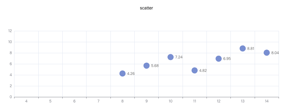
python
import swanlab

swanlab.init(project="echarts-test")

# 定义数据
data = [
    [10.0, 8.04],
    [8.0, 6.95],
    [13.0, 7.58],
    [9.0, 8.81],
    [11.0, 8.33],
    [14.0, 9.96],
    [6.0, 7.24],
    [4.0, 4.26],
    [12.0, 10.84],
    [7.0, 4.82],
    [5.0, 5.68],
]
data.sort(key=lambda x: x[0])
x_data = [d[0] for d in data]
y_data = [d[1] for d in data]

# 创建echarts scatter对象
scatter = swanlab.echarts.Scatter()

# 设置x轴数据并配置标签显示
scatter.add_xaxis(x_data)
scatter.add_yaxis(
  "",
  y_data,
  symbol_size=20,
)

# 记录到swanlab
swanlab.log({"scatter": scatter})
雷达图 radar
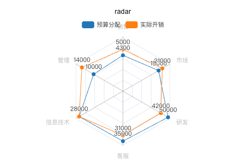
python
import swanlab

swanlab.init(project="echarts-test")

# 定义数据
v1 = [[4300, 10000, 28000, 35000, 50000, 19000]]
v2 = [[5000, 14000, 28000, 31000, 42000, 21000]]

# 创建echarts scatter对象
radar = swanlab.echarts.Radar()

# 设置雷达图维度与数据范围
radar.add_schema(
    schema=[
        {"name": "销售", "max": 6500},
        {"name": "管理", "max": 16000},
        {"name": "信息技术", "max": 30000},
        {"name": "客服", "max": 38000},
        {"name": "研发", "max": 52000},
        {"name": "市场", "max": 25000},
    ]
)

# 添加数据1
radar.add(
    "预算分配",
    v1,
    color="#1f77b4",
)

# 添加数据2
radar.add(
    "实际开销",
    v2,
    color="#ff7f0e",
)


# 记录到swanlab
swanlab.log({"radar": radar})
箱线图 boxplot
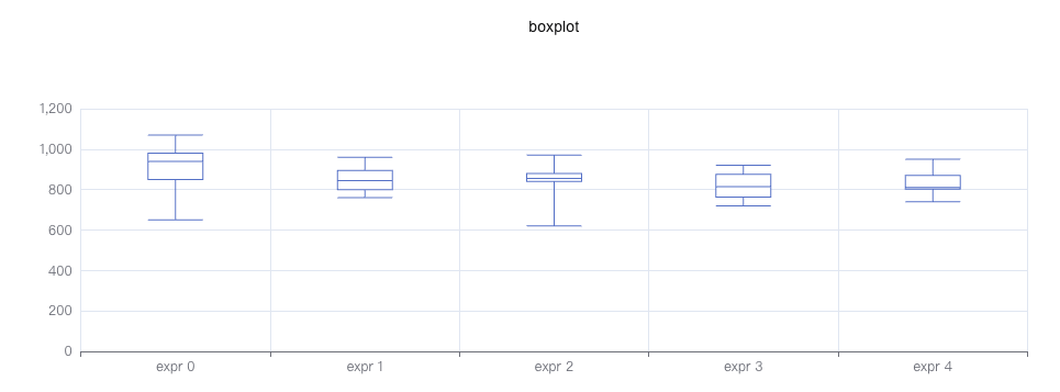
python
import swanlab

swanlab.init(project="echarts-test")

# 定义数据
y_data = [
    [850, 740, 900, 1070, 930, 850, 950, 980, 980, 880, 1000, 980, 930, 650, 760, 810, 1000, 1000, 960, 960, ],
    [960, 940, 960, 940, 880, 800, 850, 880, 900, 840, 830, 790, 810, 880, 880, 830, 800, 790, 760, 800, ],
    [880, 880, 880, 860, 720, 720, 620, 860, 970, 950, 880, 910, 850, 870, 840, 840, 850, 840, 840, 840, ],
    [890, 810, 810, 820, 800, 770, 760, 740, 750, 760, 910, 920, 890, 860, 880, 720, 840, 850, 850, 780, ],
    [890, 840, 780, 810, 760, 810, 790, 810, 820, 850, 870, 870, 810, 740, 810, 940, 950, 800, 810, 870, ],
]

scatter_data = [650, 620, 720, 720, 950, 970]
# 创建echarts table对象
boxplot = swanlab.echarts.Boxplot()

# 设置表头
boxplot.add_xaxis(["expr 0", "expr 1", "expr 2", "expr 3", "expr 4"])
boxplot.add_yaxis("", boxplot.prepare_data(y_data))

# 记录到swanlab
swanlab.log({"boxplot": boxplot})
平行坐标系图 parallel
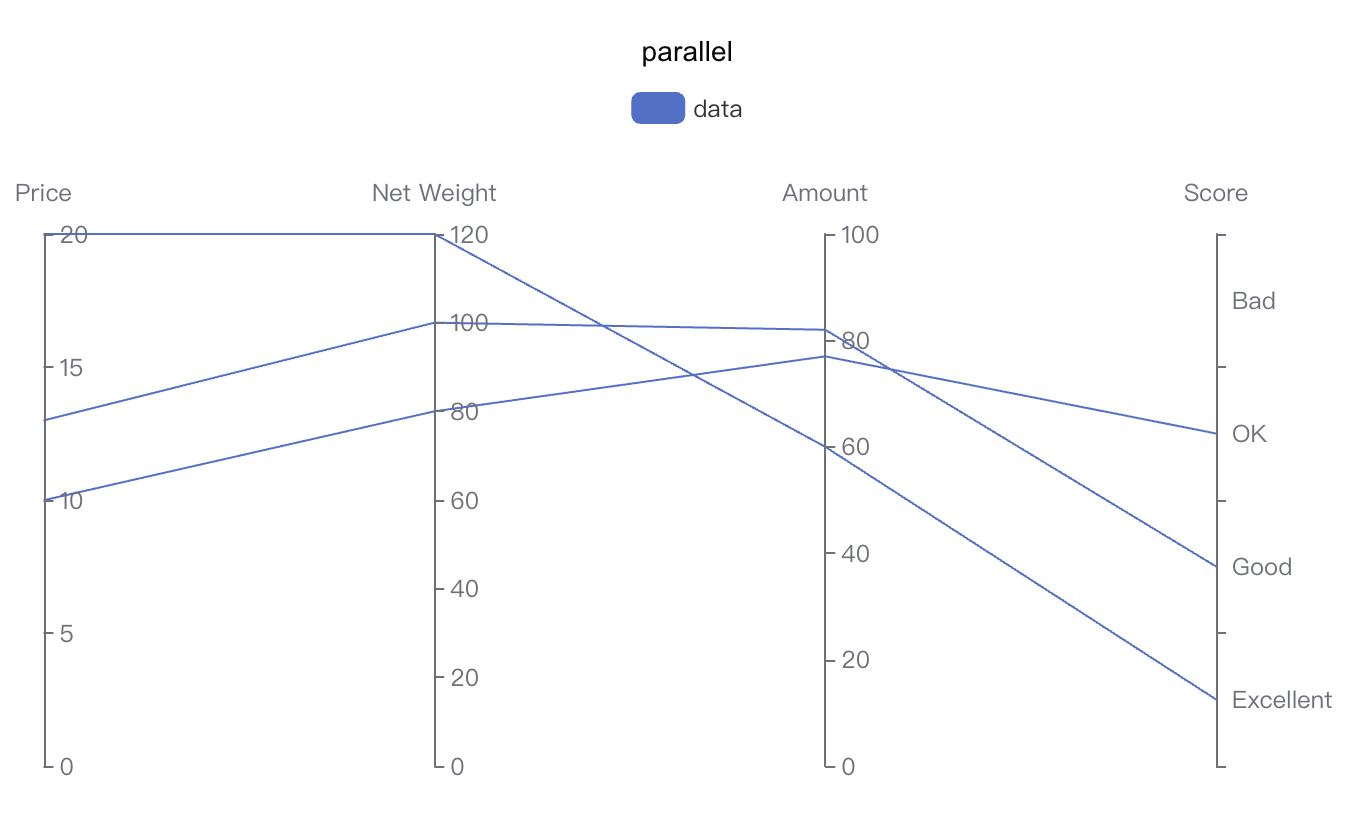
python
import swanlab

swanlab.init(project="echarts-test")

# 定义数据
parallel_axis = [
    {"dim": 0, "name": "Price"},
    {"dim": 1, "name": "Net Weight"},
    {"dim": 2, "name": "Amount"},
    {
        "dim": 3,
        "name": "Score",
        "type": "category",
        "data": ["Excellent", "Good", "OK", "Bad"],
    },
]

data = [[12.99, 100, 82, "Good"], [9.99, 80, 77, "OK"], [20, 120, 60, "Excellent"]]

# 创建echarts parallel对象
parallel = swanlab.echarts.Parallel()

# 设置parallel的轴
parallel.add_schema(parallel_axis)
# 设置parallel的数据
parallel.add("data", data=data)

# 记录到swanlab
swanlab.log({"parallel": parallel})
仪表盘图 gauge
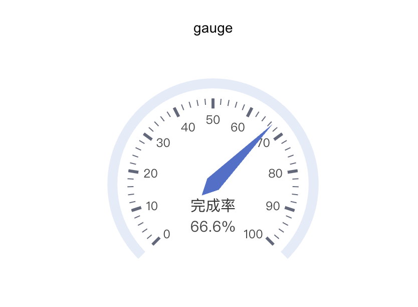
python
import swanlab

swanlab.init(project="echarts-test")

# 创建echarts gauge对象
gauge = swanlab.echarts.Gauge()
gauge.add("", [("完成率", 66.6)])

# 记录到swanlab
swanlab.log({"gauge": gauge})
表格 table
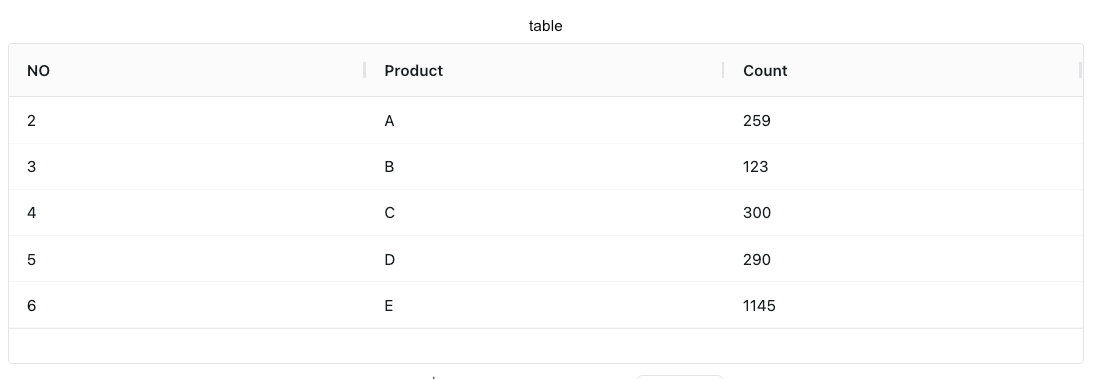
python
import swanlab

swanlab.init(
    project="echarts-test",
)

# 定义表头
headers = ["NO", "Product", "Count"]
# 定义数据
rows = [
    [2, "A", 259],
    [3, "B", 123],
    [4, "C", 300],
    [5, "D", 290],
    [6, "E", 1145],
]

# 创建echarts table对象
table = swanlab.echarts.Table()

# 添加数据
table.add(headers, rows)

# 记录到swanlab
swanlab.log({"table": table})
树状图 tree
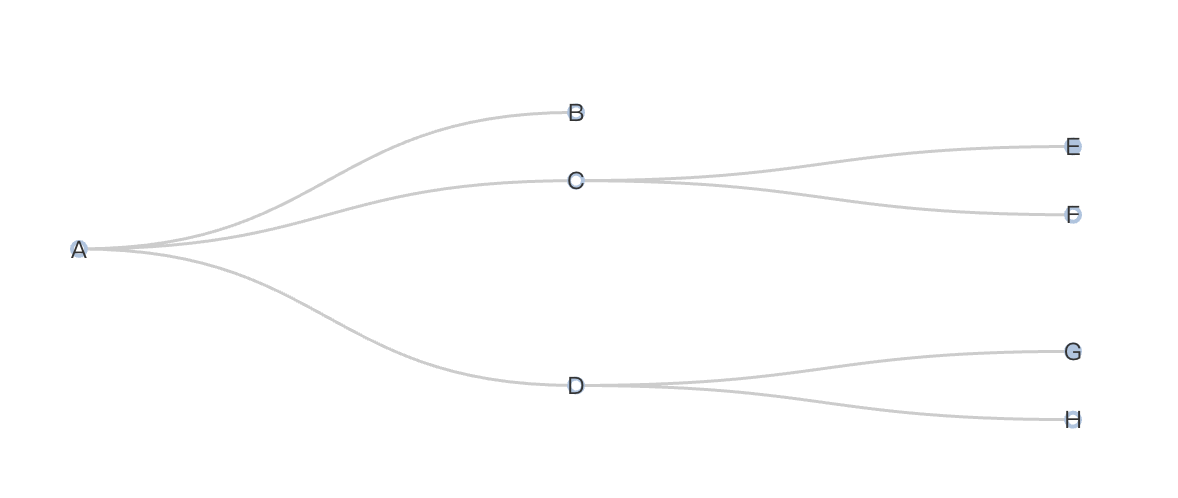
python
import swanlab

swanlab.init(project="swanlab-echarts-demo")

# 构造数据
data = [
    {
        "children": [
            {"name": "B"},
            {
                "children": [{"children": [{"name": "I"}], "name": "E"}, {"name": "F"}],
                "name": "C",
            },
            {
                "children": [
                    {"children": [{"name": "J"}, {"name": "K"}], "name": "G"},
                    {"name": "H"},
                ],
                "name": "D",
            },
        ],
        "name": "A",
    }
]

# 创建echarts tree对象
tree = swanlab.echarts.Tree()

# 设置tree数据
tree.add("tree", data=data)

# 记录到swanlab
swanlab.log({"tree": tree})
桑基图 sankey
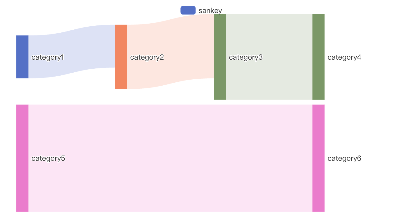
python
import swanlab
from pyecharts import options as opts

swanlab.init(project="swanlab-echarts-demo")

# 构造数据
nodes = [
    {"name": "category1"},
    {"name": "category2"},
    {"name": "category3"},
    {"name": "category4"},
    {"name": "category5"},
    {"name": "category6"},
]

links = [
    {"source": "category1", "target": "category2", "value": 10},
    {"source": "category2", "target": "category3", "value": 15},
    {"source": "category3", "target": "category4", "value": 20},
    {"source": "category5", "target": "category6", "value": 25},
]

# 创建echarts sankey对象
sankey = swanlab.echarts.Sankey()

# 设置sankey数据
sankey.add(
    "sankey",
    nodes=nodes,
    links=links,
    linestyle_opt=opts.LineStyleOpts(opacity=0.2, curve=0.5, color="source"),
    label_opts=opts.LabelOpts(position="right"),
)

# 记录到swanlab
swanlab.log({"sankey": sankey})
3D柱状图 bar3d
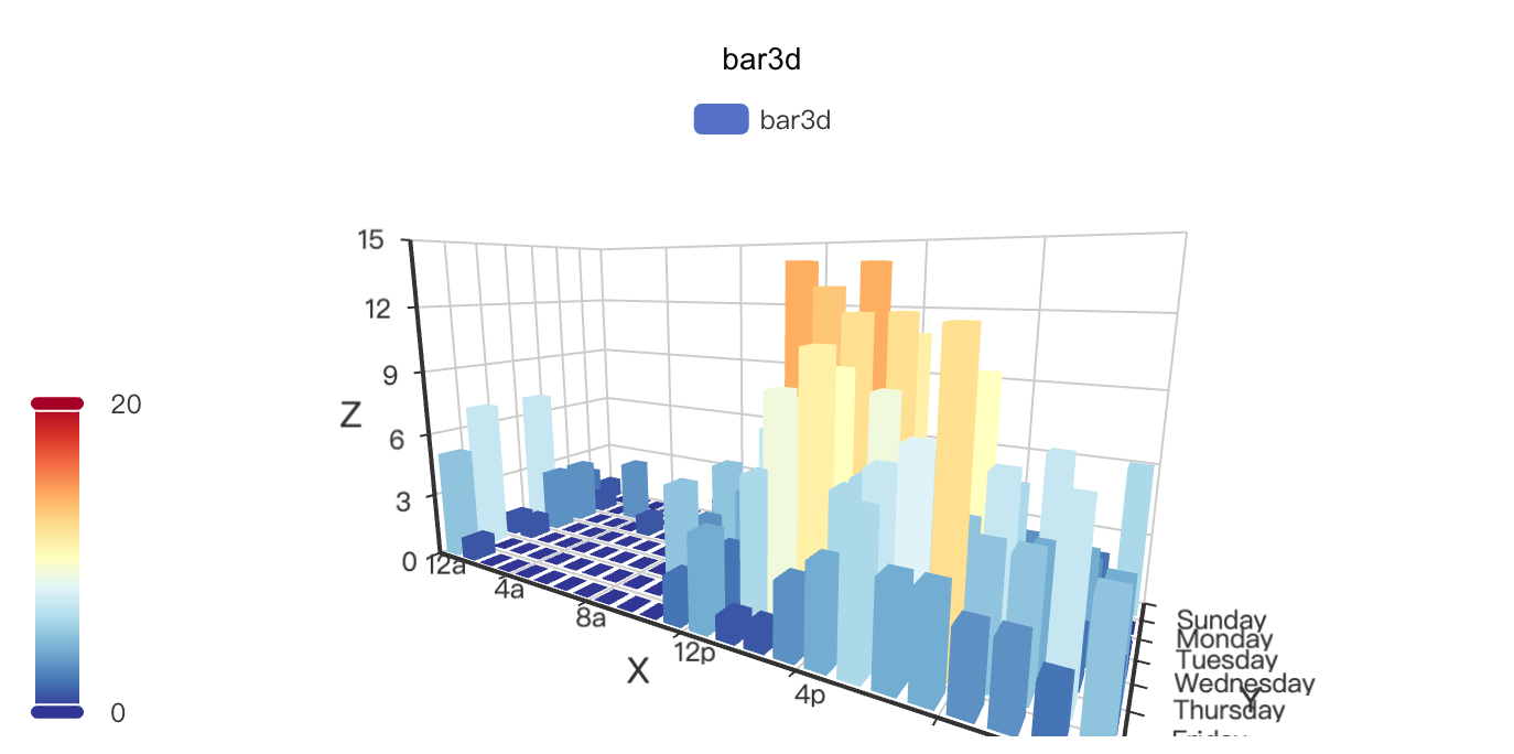
python
import swanlab
import pyecharts.options as opts

swanlab.init(project="swanlab-echarts-3d-demo")

# 定义数据
hours = ["12a", "1a", "2a", "3a", "4a", "5a", "6a", "7a", "8a", "9a", "10a", "11a", "12p", "1p", "2p", "3p", "4p", "5p", "6p", "7p", "8p", "9p", "10p", "11p"]

days = ["Saturday", "Friday", "Thursday", "Wednesday", "Tuesday", "Monday", "Sunday"]

data = [
    [0, 0, 5], [0, 1, 1], [0, 2, 0], [0, 3, 0], [0, 4, 0], [0, 5, 0], [0, 6, 0], [0, 7, 0], [0, 8, 0], [0, 9, 0], [0, 10, 0], [0, 11, 2], [0, 12, 4], [0, 13, 1], [0, 14, 1], [0, 15, 3], [0, 16, 4], [0, 17, 6], [0, 18, 4], [0, 19, 4], [0, 20, 3], [0, 21, 3], [0, 22, 2], [0, 23, 5],
    [1, 0, 7],[1, 1, 0],[1, 2, 0],[1, 3, 0],[1, 4, 0],[1, 5, 0],[1, 6, 0],[1, 7, 0],[1, 8, 0],[1, 9, 0],[1, 10, 5],[1, 11, 2],[1, 12, 2],[1, 13, 6],[1, 14, 9],[1, 15, 11],[1, 16, 6],[1, 17, 7],[1, 18, 8],[1, 19, 12],[1, 20, 5],[1, 21, 5],[1, 22, 7],[1, 23, 2],
    [2, 0, 1],[2, 1, 1],[2, 2, 0],[2, 3, 0],[2, 4, 0],[2, 5, 0],[2, 6, 0],[2, 7, 0],[2, 8, 0],[2, 9, 0],[2, 10, 3],[2, 11, 2],[2, 12, 1],[2, 13, 9],[2, 14, 8],[2, 15, 10],[2, 16, 6],[2, 17, 5],[2, 18, 5],[2, 19, 5],[2, 20, 7],[2, 21, 4],[2, 22, 2],[2, 23, 4],
    [3, 0, 7],[3, 1, 3],[3, 2, 0],[3, 3, 0],[3, 4, 0],[3, 5, 0],[3, 6, 0],[3, 7, 0],[3, 8, 1],[3, 9, 0],[3, 10, 5],[3, 11, 4],[3, 12, 7],[3, 13, 14],[3, 14, 13],[3, 15, 12],[3, 16, 9],[3, 17, 5],[3, 18, 5],[3, 19, 10],[3, 20, 6],[3, 21, 4],[3, 22, 4],[3, 23, 1],
    [4, 0, 1],[4, 1, 3],[4, 2, 0],[4, 3, 0],[4, 4, 0],[4, 5, 1],[4, 6, 0],[4, 7, 0],[4, 8, 0],[4, 9, 2],[4, 10, 4],[4, 11, 4],[4, 12, 2],[4, 13, 4],[4, 14, 4],[4, 15, 14],[4, 16, 12],[4, 17, 1],[4, 18, 8],[4, 19, 5],[4, 20, 3],[4, 21, 7],[4, 22, 3],[4, 23, 0],
    [5, 0, 2],[5, 1, 1],[5, 2, 0],[5, 3, 3],[5, 4, 0],[5, 5, 0],[5, 6, 0],[5, 7, 0],[5, 8, 2],[5, 9, 0],[5, 10, 4],[5, 11, 1],[5, 12, 5],[5, 13, 10],[5, 14, 5],[5, 15, 7],[5, 16, 11],[5, 17, 6],[5, 18, 0],[5, 19, 5],[5, 20, 3],[5, 21, 4],[5, 22, 2],[5, 23, 0],
    [6, 0, 1],[6, 1, 0],[6, 2, 0],[6, 3, 0],[6, 4, 0],[6, 5, 0],[6, 6, 0],[6, 7, 0],[6, 8, 0],[6, 9, 0],[6, 10, 1],[6, 11, 0],[6, 12, 2],[6, 13, 1],[6, 14, 3],[6, 15, 4],[6, 16, 0],[6, 17, 0],[6, 18, 0],[6, 19, 0],[6, 20, 1],[6, 21, 2],[6, 22, 2],[6, 23, 6],
]
data = [[d[1], d[0], d[2]] for d in data]

# 创建echarts bar3d对象
bar3d = swanlab.echarts.Bar3D()

# 设置bar3d数据
bar3d.add(
    "bar3d",
    data,
    xaxis3d_opts=opts.Axis3DOpts(data=hours, type_="category"),
    yaxis3d_opts=opts.Axis3DOpts(data=days, type_="category"),
    zaxis3d_opts=opts.Axis3DOpts(data=data, type_="value"),
)

bar3d.set_global_opts(
        visualmap_opts=opts.VisualMapOpts(
            max_=20,
            range_color=[
                "#313695",
                "#4575b4",
                "#74add1",
                "#abd9e9",
                "#e0f3f8",
                "#ffffbf",
                "#fee090",
                "#fdae61",
                "#f46d43",
                "#d73027",
                "#a50026",
            ],
        )
    )

# 记录到swanlab
swanlab.log({"bar3d": bar3d})
3D散点图 scatter3d
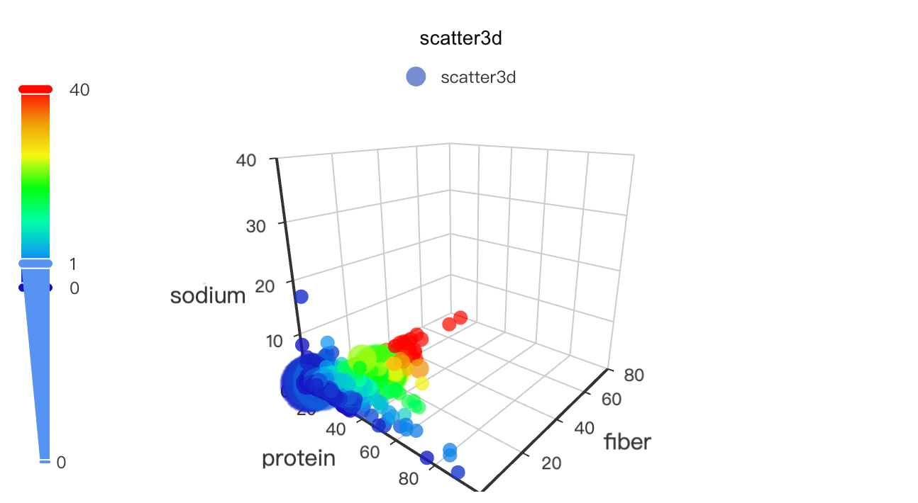
python
import asyncio
from aiohttp import TCPConnector, ClientSession
import swanlab
import pyecharts.options as opts

swanlab.init(project="swanlab-echarts-3d-demo")

# 定义数据
async def get_json_data(url: str) -> dict:
    async with ClientSession(connector=TCPConnector(ssl=False)) as session:
        async with session.get(url=url) as response:
            return await response.json()


# 获取echarts官方示例数据
data = asyncio.run(
    get_json_data(
        url="https://echarts.apache.org/examples/data/asset/data/nutrients.json"
    )
)

# 列名映射
field_indices = {
    "calcium": 3,
    "calories": 12,
    "carbohydrate": 8,
    "fat": 10,
    "fiber": 5,
    "group": 1,
    "id": 16,
    "monounsat": 14,
    "name": 0,
    "polyunsat": 15,
    "potassium": 7,
    "protein": 2,
    "saturated": 13,
    "sodium": 4,
    "sugars": 9,
    "vitaminc": 6,
    "water": 11,
}

# 配置 config
config_xAxis3D = "protein"
config_yAxis3D = "fiber"
config_zAxis3D = "sodium"
config_color = "fiber"
config_symbolSize = "vitaminc"

# 构造数据
"""
数据结构为[[x, y, z, color, size, index]]
例子:
[[19.9, 0.4, 0.385, 0.4, 0.0769, 0],
[35.8, 2, 0.717, 2, 0.138, 1],
[23.5, 1.6, 0.78, 1.6, 0.0012, 2], ...]
"""
data = [
    [
        item[field_indices[config_xAxis3D]],
        item[field_indices[config_yAxis3D]],
        item[field_indices[config_zAxis3D]],
        item[field_indices[config_color]],
        item[field_indices[config_symbolSize]],
        index,
    ]
    for index, item in enumerate(data)
]

# 创建echarts scatter3d对象
scatter3d = swanlab.echarts.Scatter3D()

# 设置scatter3d数据
scatter3d.add(
    "scatter3d",
    data,
    xaxis3d_opts=opts.Axis3DOpts(name=config_xAxis3D, type_="value"),
    yaxis3d_opts=opts.Axis3DOpts(name=config_yAxis3D, type_="value"),
    zaxis3d_opts=opts.Axis3DOpts(name=config_zAxis3D, type_="value"),
    grid3d_opts=opts.Grid3DOpts(width=100, height=100, depth=100),
)
scatter3d.set_global_opts(
        visualmap_opts=[
            opts.VisualMapOpts(
                type_="color",
                is_calculable=True,
                dimension=3,
                pos_top="10",
                max_=79 / 2,
                range_color=[
                    "#1710c0",
                    "#0b9df0",
                    "#00fea8",
                    "#00ff0d",
                    "#f5f811",
                    "#f09a09",
                    "#fe0300",
                ],
            ),
            opts.VisualMapOpts(
                type_="size",
                is_calculable=True,
                dimension=4,
                pos_bottom="10",
                max_=2.4 / 2,
                range_size=[10, 40],
            ),
        ]
    )

# 记录到swanlab
swanlab.log({"scatter3d": scatter3d})
3D折线图 line3d
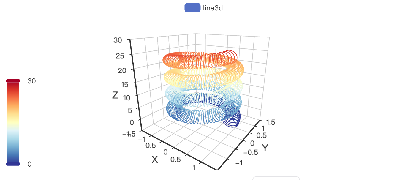
python
import math
import swanlab
import pyecharts.options as opts
from pyecharts.faker import Faker


swanlab.init(project="swanlab-echarts-3d-demo")

# 构造数据
data = []
for t in range(0, 25000):
    _t = t / 1000
    x = (1 + 0.25 * math.cos(75 * _t)) * math.cos(_t)
    y = (1 + 0.25 * math.cos(75 * _t)) * math.sin(_t)
    z = _t + 2.0 * math.sin(75 * _t)
    data.append([x, y, z])


# 创建echarts line3d对象
line3d = swanlab.echarts.Line3D()

# 设置line3d数据
line3d.add(
    "line3d",
    data,
    xaxis3d_opts=opts.Axis3DOpts(Faker.clock, type_="value"),
    yaxis3d_opts=opts.Axis3DOpts(Faker.week_en, type_="value"),
    grid3d_opts=opts.Grid3DOpts(width=100, depth=100),
)

line3d.set_global_opts(
        visualmap_opts=opts.VisualMapOpts(
            max_=30, min_=0, range_color=Faker.visual_color
        ),
    )

# 记录到swanlab
swanlab.log({"line3d": line3d})
3D曲面图 3d_surface
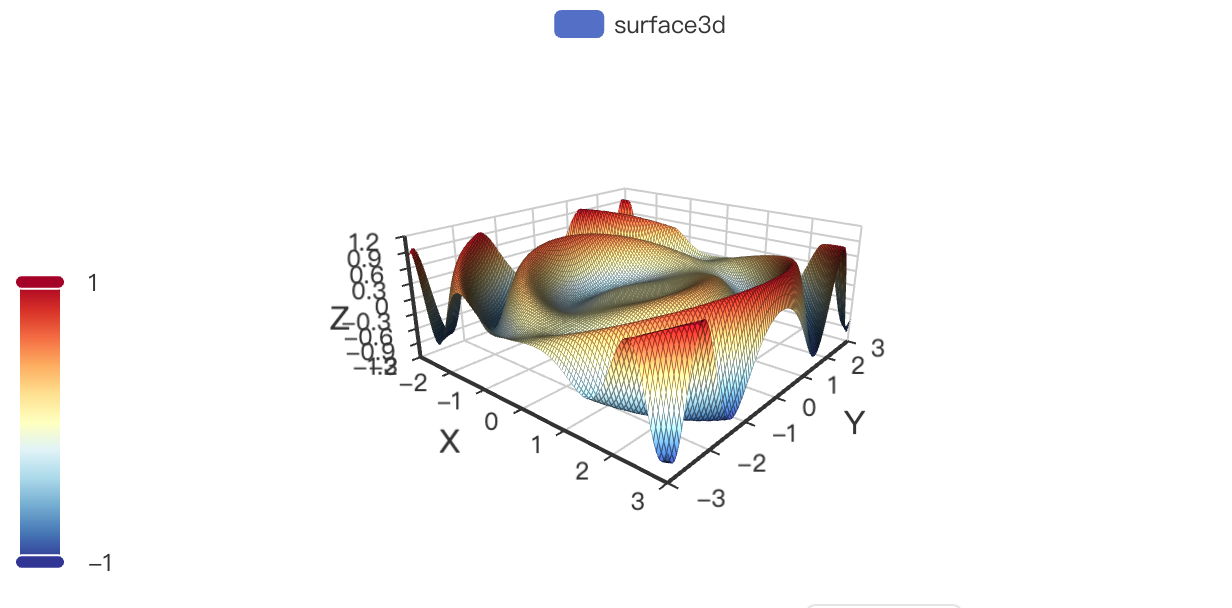
python
import math
import swanlab
import pyecharts.options as opts
from typing import Union

swanlab.init(project="swanlab-echarts-3d-demo")

# 构造数据
def float_range(start: int, end: int, step: Union[int, float], round_number: int = 2):
    """
    浮点数 range
    :param start: 起始值
    :param end: 结束值
    :param step: 步长
    :param round_number: 精度
    :return: 返回一个 list
    """
    temp = []
    while True:
        if start < end:
            temp.append(round(start, round_number))
            start += step
        else:
            break
    return temp


def surface3d_data():
    for t0 in float_range(-3, 3, 0.05):
        y = t0
        for t1 in float_range(-3, 3, 0.05):
            x = t1
            z = math.sin(x**2 + y**2) * x / 3.14
            yield [x, y, z]


# 创建echarts surface3d对象
surface3d = swanlab.echarts.Surface3D()

# 设置surface3d数据
surface3d.add(
    "surface3d",
    data=list(surface3d_data()),
    xaxis3d_opts=opts.Axis3DOpts(type_="value"),
    yaxis3d_opts=opts.Axis3DOpts(type_="value"),
    grid3d_opts=opts.Grid3DOpts(width=100, height=40, depth=100),
)

surface3d.set_global_opts(
        visualmap_opts=opts.VisualMapOpts(
            dimension=2,
            max_=1,
            min_=-1,
            range_color=[
                "#313695",
                "#4575b4",
                "#74add1",
                "#abd9e9",
                "#e0f3f8",
                "#ffffbf",
                "#fee090",
                "#fdae61",
                "#f46d43",
                "#d73027",
                "#a50026",
            ],
        )
    )

# 记录到swanlab
swanlab.log({"surface3d": surface3d})