Log Custom Chart
SwanLab provides API compatibility with pyecharts, enabling seamless recording of pyecharts charts to SwanLab for rich visualization. Click the tag below for an online demo:

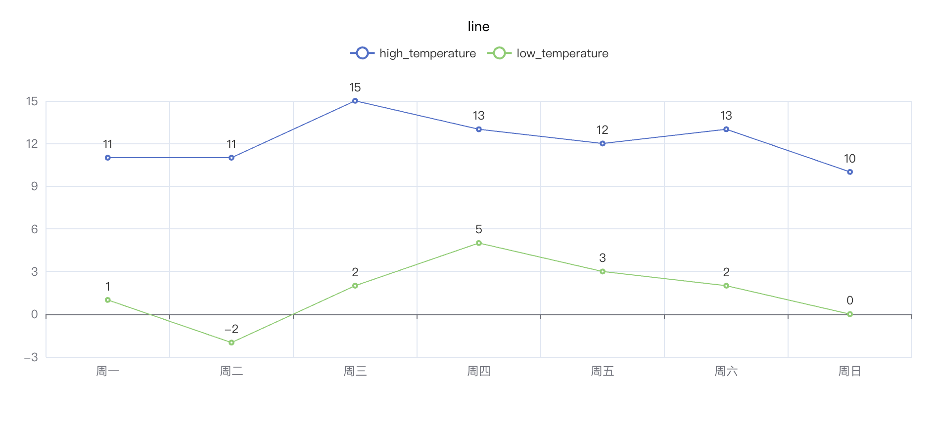
Line
python
import swanlab
swanlab.init(project="echarts-test")
# Define data
week_name_list = ["周一", "周二", "周三", "周四", "周五", "周六", "周日"]
high_temperature = [11, 11, 15, 13, 12, 13, 10]
low_temperature = [1, -2, 2, 5, 3, 2, 0]
# Create echarts line object
line = swanlab.echarts.Line()
# Set line axis
line.add_xaxis(week_name_list)
# Set line data
line.add_yaxis("high_temperature", high_temperature)
line.add_yaxis("low_temperature", low_temperature)
# Log to SwanLab
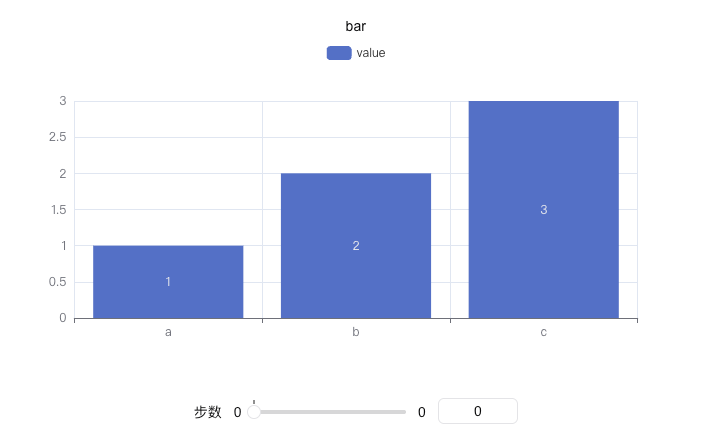
swanlab.log({"line": line})Bar Chart
python
import swanlab

swanlab.init(project="echarts-test")

# Define data
x = ["a", "b", "c"]
y = [1, 2, 3]

# Create echarts bar object
bar = swanlab.echarts.Bar()

# Set x-axis data
bar.add_xaxis(x)
# Set y-axis data
bar.add_yaxis("value", y)

# Log to SwanLab
swanlab.log({"bar": bar})
Pie Chart
python
import swanlab
swanlab.init(project="echarts-test")
# Define data
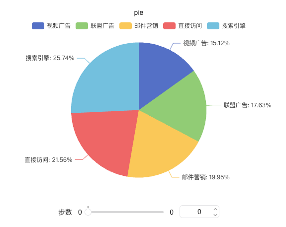
x_data = ["Direct", "Email", "Affiliate", "Video", "Search Engine"]
y_data = [335, 310, 274, 235, 400]
# Pair data
data_pair = [list(z) for z in zip(x_data, y_data)]
data_pair.sort(key=lambda x: x[1])
# Create echarts pie object
pie = swanlab.echarts.Pie()
# Set data and configure label display
pie.add(
"Traffic Sources",
data_pair,
label_opts={
"formatter": "{b}: {d}%", # Show percentage
"position": "outside" # Label position
}
)
# Log to SwanLab
swanlab.log({"pie": pie})Heatmap
python
import swanlab
swanlab.init(project="echarts-test")
# Define data
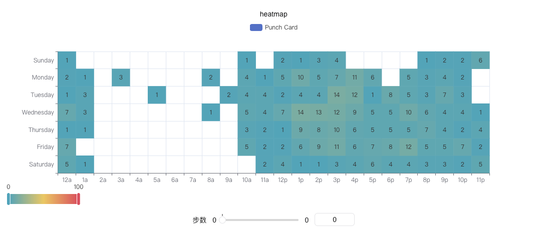
hours = ["12a", "1a", "2a", "3a", "4a", "5a", "6a", "7a", "8a", "9a", "10a", "11a",
"12p", "1p", "2p", "3p", "4p", "5p", "6p", "7p", "8p", "9p", "10p", "11p"]
days = ["Saturday", "Friday", "Thursday", "Wednesday", "Tuesday", "Monday", "Sunday"]
data = [
[0, 0, 5], [0, 1, 1], [0, 2, 0], [0, 3, 0], [0, 4, 0], [0, 5, 0], [0, 6, 0], [0, 7, 0], [0, 8, 0], [0, 9, 0], [0, 10, 0], [0, 11, 2], [0, 12, 4], [0, 13, 1], [0, 14, 1], [0, 15, 3], [0, 16, 4], [0, 17, 6], [0, 18, 4], [0, 19, 4], [0, 20, 3], [0, 21, 3], [0, 22, 2], [0, 23, 5],
[1, 0, 7],[1, 1, 0],[1, 2, 0],[1, 3, 0],[1, 4, 0],[1, 5, 0],[1, 6, 0],[1, 7, 0],[1, 8, 0],[1, 9, 0],[1, 10, 5],[1, 11, 2],[1, 12, 2],[1, 13, 6],[1, 14, 9],[1, 15, 11],[1, 16, 6],[1, 17, 7],[1, 18, 8],[1, 19, 12],[1, 20, 5],[1, 21, 5],[1, 22, 7],[1, 23, 2],
[2, 0, 1],[2, 1, 1],[2, 2, 0],[2, 3, 0],[2, 4, 0],[2, 5, 0],[2, 6, 0],[2, 7, 0],[2, 8, 0],[2, 9, 0],[2, 10, 3],[2, 11, 2],[2, 12, 1],[2, 13, 9],[2, 14, 8],[2, 15, 10],[2, 16, 6],[2, 17, 5],[2, 18, 5],[2, 19, 5],[2, 20, 7],[2, 21, 4],[2, 22, 2],[2, 23, 4],
[3, 0, 7],[3, 1, 3],[3, 2, 0],[3, 3, 0],[3, 4, 0],[3, 5, 0],[3, 6, 0],[3, 7, 0],[3, 8, 1],[3, 9, 0],[3, 10, 5],[3, 11, 4],[3, 12, 7],[3, 13, 14],[3, 14, 13],[3, 15, 12],[3, 16, 9],[3, 17, 5],[3, 18, 5],[3, 19, 10],[3, 20, 6],[3, 21, 4],[3, 22, 4],[3, 23, 1],
[4, 0, 1],[4, 1, 3],[4, 2, 0],[4, 3, 0],[4, 4, 0],[4, 5, 1],[4, 6, 0],[4, 7, 0],[4, 8, 0],[4, 9, 2],[4, 10, 4],[4, 11, 4],[4, 12, 2],[4, 13, 4],[4, 14, 4],[4, 15, 14],[4, 16, 12],[4, 17, 1],[4, 18, 8],[4, 19, 5],[4, 20, 3],[4, 21, 7],[4, 22, 3],[4, 23, 0],
[5, 0, 2],[5, 1, 1],[5, 2, 0],[5, 3, 3],[5, 4, 0],[5, 5, 0],[5, 6, 0],[5, 7, 0],[5, 8, 2],[5, 9, 0],[5, 10, 4],[5, 11, 1],[5, 12, 5],[5, 13, 10],[5, 14, 5],[5, 15, 7],[5, 16, 11],[5, 17, 6],[5, 18, 0],[5, 19, 5],[5, 20, 3],[5, 21, 4],[5, 22, 2],[5, 23, 0],
[6, 0, 1],[6, 1, 0],[6, 2, 0],[6, 3, 0],[6, 4, 0],[6, 5, 0],[6, 6, 0],[6, 7, 0],[6, 8, 0],[6, 9, 0],[6, 10, 1],[6, 11, 0],[6, 12, 2],[6, 13, 1],[6, 14, 3],[6, 15, 4],[6, 16, 0],[6, 17, 0],[6, 18, 0],[6, 19, 0],[6, 20, 1],[6, 21, 2],[6, 22, 2],[6, 23, 6],
]
data = [[d[1], d[0], d[2] or "-"] for d in data]
# Create echarts heatmap object
heatmap = swanlab.echarts.HeatMap()
# Set axis data
heatmap.add_xaxis(hours)
heatmap.add_yaxis(
"Punch Card",
days,
data,
)
# Log to SwanLab
swanlab.log({"heatmap": heatmap})python
# demo link: https://swanlab.cn/@ZeyiLin/swanlab-echarts-demo/runs/c1wm57rkfnwkyz7kaat8a/chart
"""
heatmap.set_global_opts(
    visualmap_opts=opts.VisualMapOpts(min_=0, max_=10, orient="horizontal"),
)
"""


import swanlab
from pyecharts import options as opts

swanlab.init(project="echarts-test")

# Define data
hours = ["12a", "1a", "2a", "3a", "4a", "5a", "6a", "7a", "8a", "9a", "10a", "11a", "12p", "1p", "2p", "3p", "4p", "5p", "6p", "7p", "8p", "9p", "10p", "11p"]

days = ["Saturday", "Friday", "Thursday", "Wednesday", "Tuesday", "Monday", "Sunday"]

data = [
    [0, 0, 5], [0, 1, 1], [0, 2, 0], [0, 3, 0], [0, 4, 0], [0, 5, 0], [0, 6, 0], [0, 7, 0], [0, 8, 0], [0, 9, 0], [0, 10, 0], [0, 11, 2], [0, 12, 4], [0, 13, 1], [0, 14, 1], [0, 15, 3], [0, 16, 4], [0, 17, 6], [0, 18, 4], [0, 19, 4], [0, 20, 3], [0, 21, 3], [0, 22, 2], [0, 23, 5],
    [1, 0, 7],[1, 1, 0],[1, 2, 0],[1, 3, 0],[1, 4, 0],[1, 5, 0],[1, 6, 0],[1, 7, 0],[1, 8, 0],[1, 9, 0],[1, 10, 5],[1, 11, 2],[1, 12, 2],[1, 13, 6],[1, 14, 9],[1, 15, 11],[1, 16, 6],[1, 17, 7],[1, 18, 8],[1, 19, 12],[1, 20, 5],[1, 21, 5],[1, 22, 7],[1, 23, 2],
    [2, 0, 1],[2, 1, 1],[2, 2, 0],[2, 3, 0],[2, 4, 0],[2, 5, 0],[2, 6, 0],[2, 7, 0],[2, 8, 0],[2, 9, 0],[2, 10, 3],[2, 11, 2],[2, 12, 1],[2, 13, 9],[2, 14, 8],[2, 15, 10],[2, 16, 6],[2, 17, 5],[2, 18, 5],[2, 19, 5],[2, 20, 7],[2, 21, 4],[2, 22, 2],[2, 23, 4],
    [3, 0, 7],[3, 1, 3],[3, 2, 0],[3, 3, 0],[3, 4, 0],[3, 5, 0],[3, 6, 0],[3, 7, 0],[3, 8, 1],[3, 9, 0],[3, 10, 5],[3, 11, 4],[3, 12, 7],[3, 13, 14],[3, 14, 13],[3, 15, 12],[3, 16, 9],[3, 17, 5],[3, 18, 5],[3, 19, 10],[3, 20, 6],[3, 21, 4],[3, 22, 4],[3, 23, 1],
    [4, 0, 1],[4, 1, 3],[4, 2, 0],[4, 3, 0],[4, 4, 0],[4, 5, 1],[4, 6, 0],[4, 7, 0],[4, 8, 0],[4, 9, 2],[4, 10, 4],[4, 11, 4],[4, 12, 2],[4, 13, 4],[4, 14, 4],[4, 15, 14],[4, 16, 12],[4, 17, 1],[4, 18, 8],[4, 19, 5],[4, 20, 3],[4, 21, 7],[4, 22, 3],[4, 23, 0],
    [5, 0, 2],[5, 1, 1],[5, 2, 0],[5, 3, 3],[5, 4, 0],[5, 5, 0],[5, 6, 0],[5, 7, 0],[5, 8, 2],[5, 9, 0],[5, 10, 4],[5, 11, 1],[5, 12, 5],[5, 13, 10],[5, 14, 5],[5, 15, 7],[5, 16, 11],[5, 17, 6],[5, 18, 0],[5, 19, 5],[5, 20, 3],[5, 21, 4],[5, 22, 2],[5, 23, 0],
    [6, 0, 1],[6, 1, 0],[6, 2, 0],[6, 3, 0],[6, 4, 0],[6, 5, 0],[6, 6, 0],[6, 7, 0],[6, 8, 0],[6, 9, 0],[6, 10, 1],[6, 11, 0],[6, 12, 2],[6, 13, 1],[6, 14, 3],[6, 15, 4],[6, 16, 0],[6, 17, 0],[6, 18, 0],[6, 19, 0],[6, 20, 1],[6, 21, 2],[6, 22, 2],[6, 23, 6],
]
data = [[d[1], d[0], d[2] or "-"] for d in data]

# Create echarts heatmap object
heatmap = swanlab.echarts.HeatMap()
heatmap.set_global_opts(
    visualmap_opts=opts.VisualMapOpts(min_=0, max_=10, orient="horizontal"),
)

# Set x-axis data and configure label display
heatmap.add_xaxis(hours)
heatmap.add_yaxis(
  "Punch Card",
  days,
  data,
)

# 记录到swanlab
swanlab.log({"heatmap_visualmapopts": heatmap})
Scatter Plot
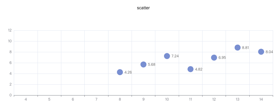
python
import swanlab

swanlab.init(project="echarts-test")

# Define data
data = [
    [10.0, 8.04],
    [8.0, 6.95],
    [13.0, 7.58],
    [9.0, 8.81],
    [11.0, 8.33],
    [14.0, 9.96],
    [6.0, 7.24],
    [4.0, 4.26],
    [12.0, 10.84],
    [7.0, 4.82],
    [5.0, 5.68],
]
data.sort(key=lambda x: x[0])
x_data = [d[0] for d in data]
y_data = [d[1] for d in data]

# Create echarts scatter object
scatter = swanlab.echarts.Scatter()

# Set data
scatter.add_xaxis(x_data)
scatter.add_yaxis(
    "",
    y_data,
    symbol_size=20,
)

# Log to SwanLab
swanlab.log({"scatter": scatter})
Radar Chart
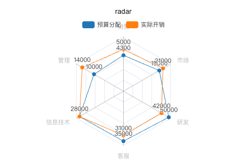
python
import swanlab

swanlab.init(project="echarts-test")

# Define data
v1 = [[4300, 10000, 28000, 35000, 50000, 19000]]
v2 = [[5000, 14000, 28000, 31000, 42000, 21000]]

# Create echarts radar object
radar = swanlab.echarts.Radar()

# Configure radar dimensions and scale
radar.add_schema(
    schema=[
        {"name": "Sales", "max": 6500},
        {"name": "Management", "max": 16000},
        {"name": "IT", "max": 30000},
        {"name": "Support", "max": 38000},
        {"name": "R&D", "max": 52000},
        {"name": "Marketing", "max": 25000},
    ]
)

# Add data series
radar.add(
    "Budget",
    v1,
    color="#1f77b4",
)

radar.add(
    "Actual",
    v2,
    color="#ff7f0e",
)

# Log to SwanLab
swanlab.log({"radar": radar})
Boxplot
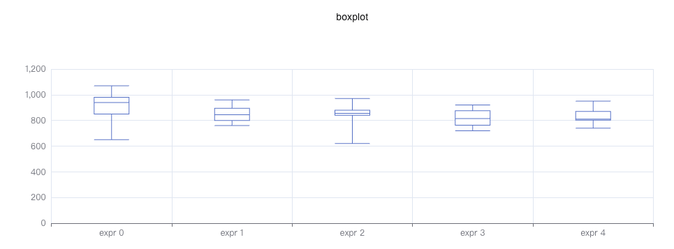
python
import swanlab

swanlab.init(project="echarts-test")

# Define data
y_data = [
    [850, 740, 900, 1070, 930, 850, 950, 980, 980, 880, 1000, 980, 930, 650, 760, 810, 1000, 1000, 960, 960],
    [960, 940, 960, 940, 880, 800, 850, 880, 900, 840, 830, 790, 810, 880, 880, 830, 800, 790, 760, 800],
    [880, 880, 880, 860, 720, 720, 620, 860, 970, 950, 880, 910, 850, 870, 840, 840, 850, 840, 840, 840],
    [890, 810, 810, 820, 800, 770, 760, 740, 750, 760, 910, 920, 890, 860, 880, 720, 840, 850, 850, 780],
    [890, 840, 780, 810, 760, 810, 790, 810, 820, 850, 870, 870, 810, 740, 810, 940, 950, 800, 810, 870],
]

# Create echarts boxplot object
boxplot = swanlab.echarts.Boxplot()

# Set data
boxplot.add_xaxis(["expr 0", "expr 1", "expr 2", "expr 3", "expr 4"])
boxplot.add_yaxis("", boxplot.prepare_data(y_data))

# Log to SwanLab
swanlab.log({"boxplot": boxplot})
Parallel
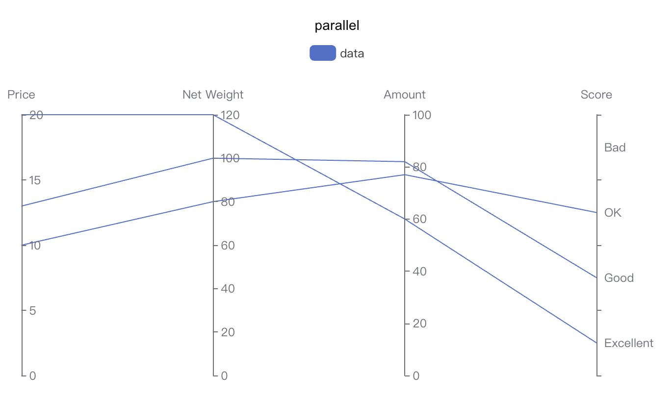
python
import swanlab

swanlab.init(project="echarts-test")

# 定义数据
parallel_axis = [
    {"dim": 0, "name": "Price"},
    {"dim": 1, "name": "Net Weight"},
    {"dim": 2, "name": "Amount"},
    {
        "dim": 3,
        "name": "Score",
        "type": "category",
        "data": ["Excellent", "Good", "OK", "Bad"],
    },
]

data = [[12.99, 100, 82, "Good"], [9.99, 80, 77, "OK"], [20, 120, 60, "Excellent"]]

# Create echarts parallel object
parallel = swanlab.echarts.Parallel()

# Set parallel axis
parallel.add_schema(parallel_axis)
# Set parallel data
parallel.add("data", data=data)

# Log to SwanLab
swanlab.log({"parallel": parallel})
Gauge
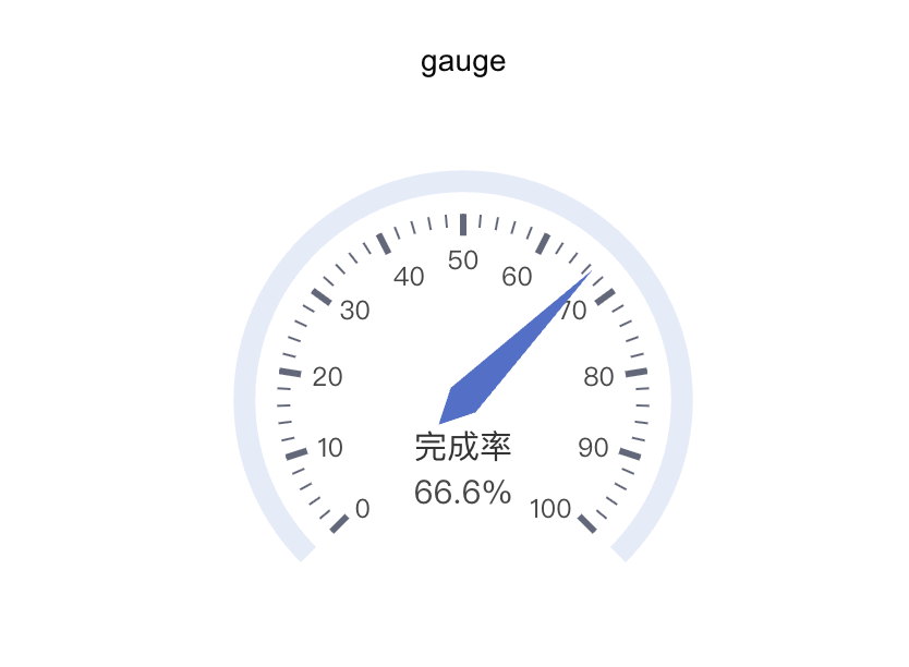
python
import swanlab

swanlab.init(project="swanlab-echarts-demo")

# Create echarts gauge object
gauge = swanlab.echarts.Gauge()
gauge.add("", [("完成率", 66.6)])

# Log to SwanLab
swanlab.log({"gauge": gauge})
Table
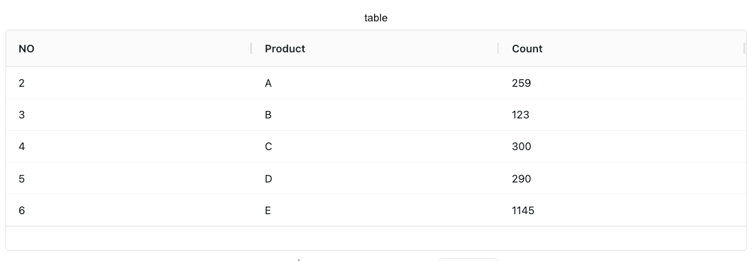
python
import swanlab

swanlab.init(project="echarts-test")

# Define headers
headers = ["NO", "Product", "Count"]
# Define data
rows = [
    [2, "A", 259],
    [3, "B", 123],
    [4, "C", 300],
    [5, "D", 290],
    [6, "E", 1145],
]

# Create echarts table object
table = swanlab.echarts.Table()

# Add data
table.add(headers, rows)

# Log to SwanLab
swanlab.log({"table": table})
Tree
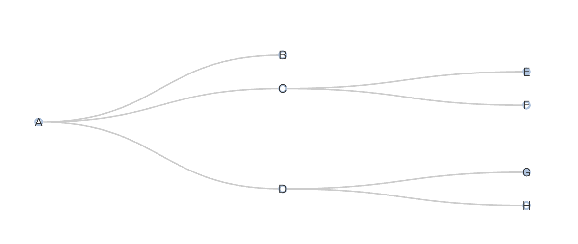
python
import swanlab

swanlab.init(project="swanlab-echarts-demo")

# Construct data
data = [
    {
        "children": [
            {"name": "B"},
            {
                "children": [{"children": [{"name": "I"}], "name": "E"}, {"name": "F"}],
                "name": "C",
            },
            {
                "children": [
                    {"children": [{"name": "J"}, {"name": "K"}], "name": "G"},
                    {"name": "H"},
                ],
                "name": "D",
            },
        ],
        "name": "A",
    }
]

# Create echarts tree object
tree = swanlab.echarts.Tree()

# Set tree data
tree.add("tree", data=data)

# Log to SwanLab
swanlab.log({"tree": tree})
Sankey
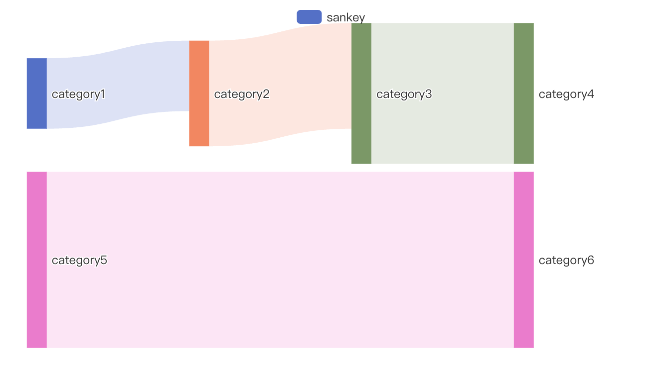
python
import swanlab
from pyecharts import options as opts

swanlab.init(project="swanlab-echarts-demo")

# Construct data
nodes = [
    {"name": "category1"},
    {"name": "category2"},
    {"name": "category3"},
    {"name": "category4"},
    {"name": "category5"},
    {"name": "category6"},
]

links = [
    {"source": "category1", "target": "category2", "value": 10},
    {"source": "category2", "target": "category3", "value": 15},
    {"source": "category3", "target": "category4", "value": 20},
    {"source": "category5", "target": "category6", "value": 25},
]

# Create echarts sankey object
sankey = swanlab.echarts.Sankey()

# Set sankey data
sankey.add(
    "sankey",
    nodes=nodes,
    links=links,
    linestyle_opt=opts.LineStyleOpts(opacity=0.2, curve=0.5, color="source"),
    label_opts=opts.LabelOpts(position="right"),
)

# Log to SwanLab
swanlab.log({"sankey": sankey})